Graphics Design and Document Design is a way for me to apply my talents for visual aesthetic to deliver a message in a clean and understandable way; to create a clear hierarchy of information.
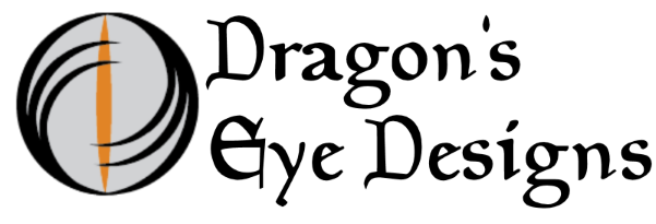
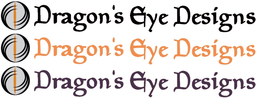
My LogoDragon's Eye Designs
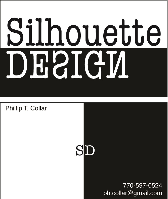
This is how I have decided to brand myself to the world. With a name, logo, and color scheme of my own design. When I chose to create myself image. I knew I wanted to use my passion for fantasy and myth. I also knew I want an older antiqued look through choice of fonts, but have a whimsical feel through the choice of colors (Using violet and lavender with pumpkin oranges.) Silhouette DesignThis is a business card I originally designed as part of a project for an Applied graphics course which further advanced my skill in design, illustration and graphics. This piece was done using Adobe Illustrator and Indesign.
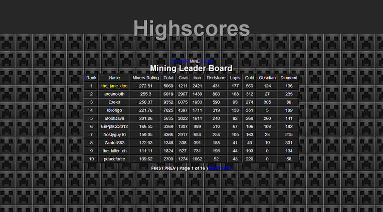
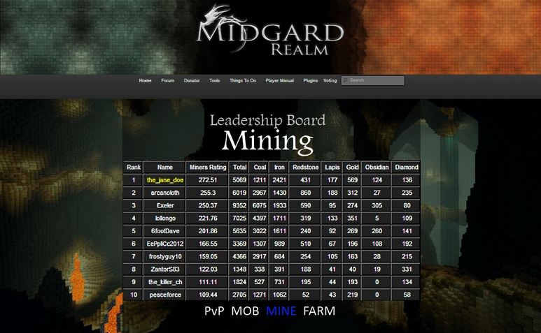
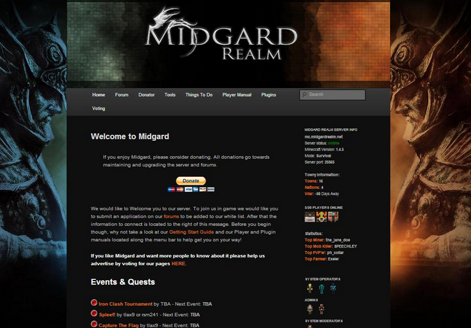
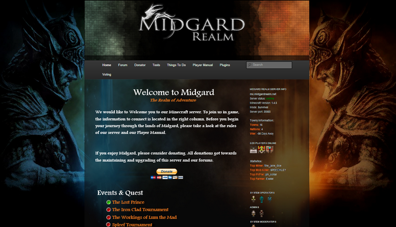
MidgardFor my Professional Editing course we were to do a comprehensive edit of a document. It could have been any document or website, but I chose to work on a site I frequent and whose owners I knew.
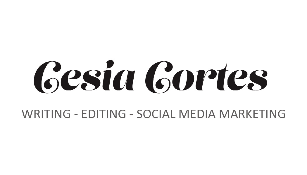
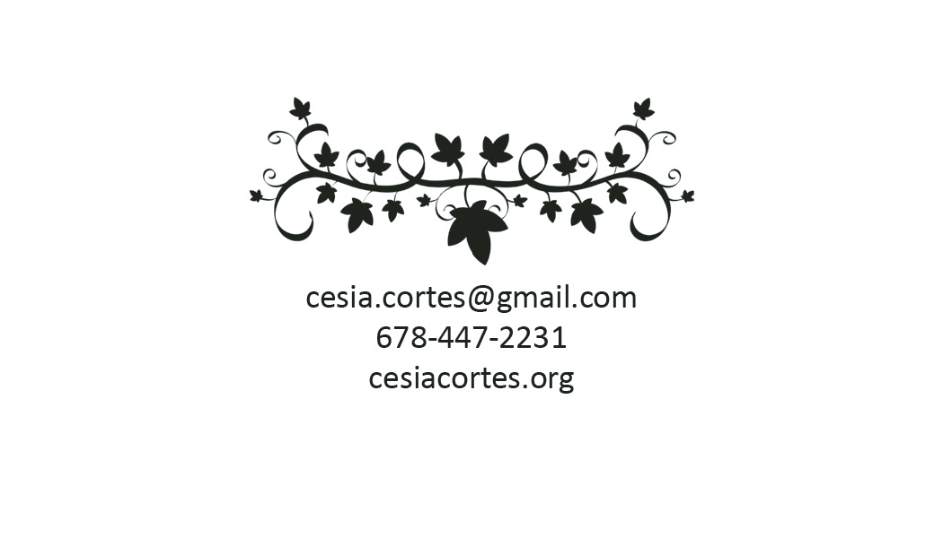
My main goal was to bring some of the sites older pages up to date with the sites style and format. I knew that the leadership boards were going to need the most redesigning. They were out of date, but were important, and frequently visited pages. I changed the backgrounds to draw emphasis to what the page was about and to liven them up. The new backgrounds also allowed for the text outside the tables to be more legible. And with the addition of the Midgard logo and navigation bar, the pages were improved dramatically. I also did a rework of the home page to try and bring a grander tone to the page. I did this primarily by changing the dark grey column in to a transparency, allowing the rich background to bleed forth. Business CardThis was a project where we had to pair up with a classmate and design a card to there specifications. Cesia told me she wanted something simple; a black and white design that was elegant.
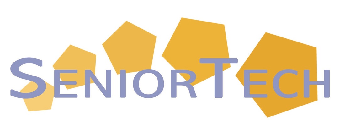
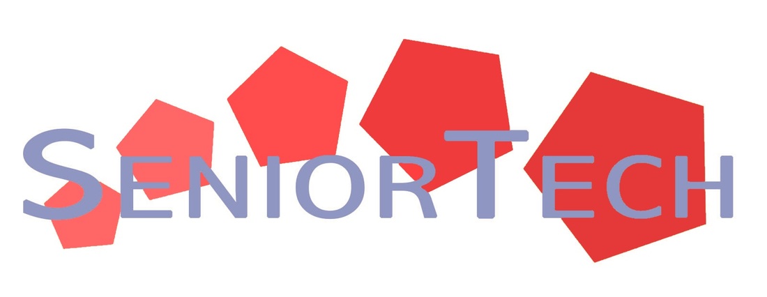
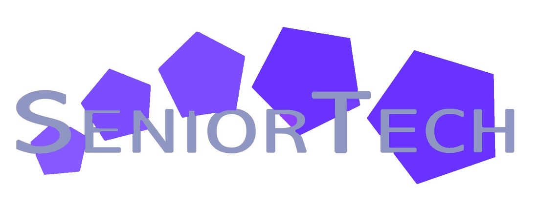
She had picked a font for her name and want a graphic to go with it. I created the vine of ivy in Illustrator to compliment the chosen font’s curves and weight. SeniorTechThis is a logo I designed for a nonprofit organization called SeniorTech. The group went to retirement homes and would give help seminars to teach the residents how to use their smart phones, laptops, and other gadgets.
I designed logos as a part of their style guide. Each logo is meant to help recognize different types of documents. (Yellow for public documents, red for interoffice memos and letters, and blue for document sent to business affiliates.) |
          |